
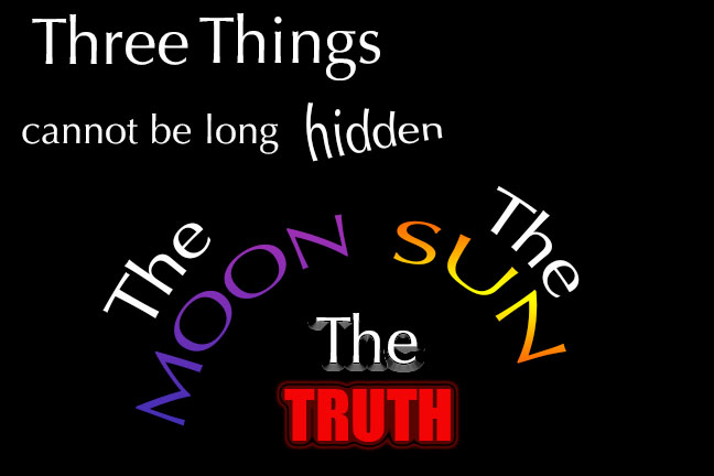
The saying I chose to use for my font poem was a quote from Buddha. That saying was “Three things cannot be long hidden: the sun, the moon, and the truth.” The reason I chose this saying was because I felt like it gave me good content to work with when creating the design portion of my font poem. I have also always been pretty interested in Buddha because I never really knew what he stood for in the past so this saying gave me more insight into that.
The fonts I chose were Optima and Eurostile. I chose the font Optima because mainly because in part of the poem I bend the words to look like they represented the rising and setting of the sun and the moon. With this font I thought the style that this font gave off when set in this manner fit this design very well. I used the Eurostile because it put a lot of emphasis on the word Truth which is the only work in the saying where I used Eurostile.
I put the first words “Three Things” first at the top in a large Optima font to have those words pop out to the eye first. The next words under that I put “cannot be long hidden” in a smaller font. I used the effect Squeeze on the word hidden to give the effect as if the word “hidden” is actually trying to be hidden. The next words I put were “The Sun, The Moon”. I placed the words to represent the rise of the sun and the setting of the moon by using the Arc effect. I changed the word moon to a purple to represent night time and the sun to orange to represent the sun. Lastly I put the words “The Truth” under the words “The Sun, The Moon”. I used the effects Bevel & Emboss and Gradient on the word “The” to have the eye lead to these words after reading “The Sun, The Moon”. I also used the Outer Glow effect on the word “Truth” to give that word the most emphasis out of the rest of the saying because this is where the saying ends.
The one problem I ran into when creating my font poem was that I wasn’t familiar with photoshop due to the fact I have never used it before but still managed to figure it out. One way I got around this was through trial and error. I tried different effects, fonts, and word placing until I thought I found the right fits. I also was given help by my professors and fellow classmates to help me through the process of getting used to photoshop.
The thing I am most proud about after making my font poem was my word placing and the effects I used on certain words. The word placing really helped step up my font poem from being just saying to actually giving the saying I used substance. This also goes for my effects. The effects in my font poen helped out a lot by giving certain words in my font poem emotion which gives off the ability for the viewer of my font poem to connect to the message my font poem is conveying.
