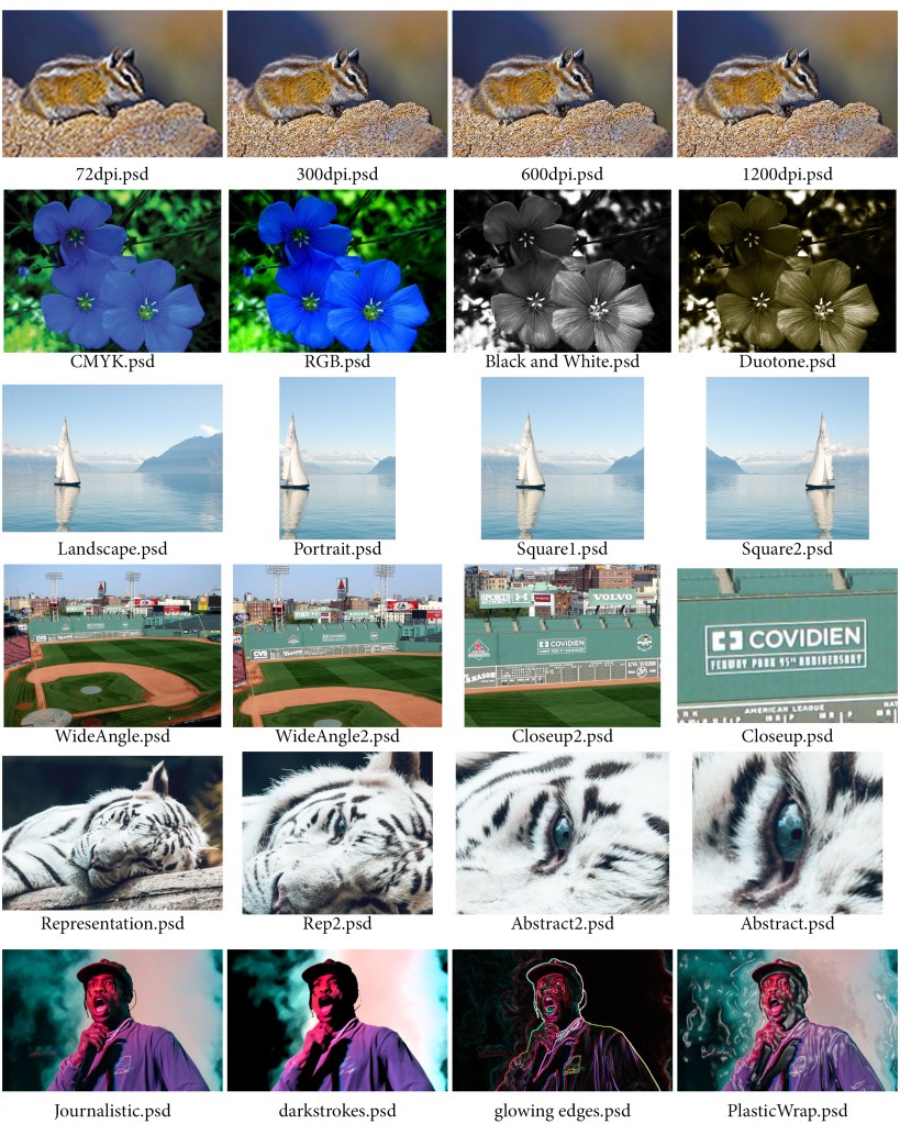
Row 1 – Resolution:
In the first row of the contact sheet we started working with the resolution of images. The first image was of a chipmunk. We started off with putting the image at 1200 DPI. 1200 DPI is used for high quality printing. DPI stands for dots per inch. The higher the dots per inch the more clear the photo is going to be. The next resolution thing I did was change the same image to 600 DPI. The way you change the DPI is through the image size under the Image tab at the top of the screen. As the DPI decreases so does the resolution causing the image to not be as clear as it was before. Next, I changed the image to have 300 DPI. 300 DPI is the same DPI magazines use. Lastly, we changed the DPI to 72 which is the lowest DPI we used throughout the contact sheet.
Row 2 – Format/Mode:
For this row we used an image of flowers. The first image started us off using the RGB color scheme. RGB stands for Red, Green, Blue so the image is created only using the colors Red, Green, and Blue. The next thing we did was change the color scheme from RGB to CMYK. CMYK stands for Cyan, Magenta, Yellow, and Black so just as the way RGB works is the same way CMYK works but instead of the image using Red, Green, and Blue to make up the image, the image uses Cyan, Magenta, Yellow, and Black. CMYK is the color scheme that printers use to print out words and images. Then we changed the image to Black and White. In order to change the image to Black and White from the original image is you need to first go into the channel mixer and click Monochrome. From there you play with the color sliders of the image to get how exactly you want to look. You then go back into the channel mixer and go into curves where you play with that where you essentially want to have the curves create and “S” shape to get the perfect shading of the image. The last image for the Format/Mode row was to change the photo to have a Duotone/Sepia tone. To do that you have to follow the instructions to get the photo Black and White like before and then flatten the image. Then go to Mode under the Image tab and change it to Grayscale. Then go back into Mode under the Image tab and change the image from Monotone to Duotone and pick another color of your choice. In my contact sheet for row 2 I chose to pick a yellowish brown color.
Row 3 – Orientation:
In row 3 we used an image of a sailboat on the water with a mountainous scenery behind it. The first image I put into the contact sheet was in Landscape. Landscape is when the width of the image is more than the height of the image. For the next image we cropped a portion of the sides of the image and then went into the ratios of the image where we changed the image from Landscape to Square. For the image after that we basically did the same thing as for the first square image but instead we went to the Image Rotate tool and flipped the image horizontally and created a second square image. The last image we made in row 3 is we went back to the original image and changed the image from Landscape to Square. After that we went to the ratio of the image and changed the ratio to 5:7 which is Portrait and cropped the sides and focused on a part of the image we wanted to focus on.
Row 4 – Framing:
In row 4 we are using an image of that was taken at Fenway Park in Boston, MA. The original image for this row is a wide angle photo of Fenway Park. This is the widest angle image that is used in this row. For image two, we are going to use the crop to and crop into the image a little from all sides of the image while making sure the image is still at its original ratio. For the third image we are going to find a part of the photo that we want to focus on so we are going to crop into the photo some more using the crop tool closer into the part of the image we want to focus on. In the last image of this we are using the crop tool again and fully crop into the image so we can only see the part of the image we have been focusing on. The part of the image I focused on was a sign that was located on the left field wall which is also known as the Green Monster.
Row 5 – Aesthetic Content:
For this row we had to go onto the internet and find our own image that we wanted to use. The image I chose for row 5 was an image of a white tiger that was laying on a log in the forest. In row 5 we basically did the same thing by finding something within the image to focus on by using the Crop tool to zone in on that part of the image and create an abstract version of the image I found. Throughout the images of row 5 I start with the whole image to then overtime cropping the image more and more till eventually all you can see in the image was just the eye of the white tiger.
Row 6 – Purpose:
For row 6 we also had to go onto the internet and search for a photo that we wanted to use for this row. The image I chose was an image of rapper Travis Scott performing a song during one of his concerts. The original photo put into row 6 is called the Journalistic photo because there has been no filters added to the photo yet. Over the span of the next three images I used the Filter tool and added one filter to each image. The filters I used for row 6 were Glowing Edges, Dark Strokes, and Plastic Wrap. Within each image I also played around with the sliders of each filter I used to get the certain effects I was trying to get out of each filter.
