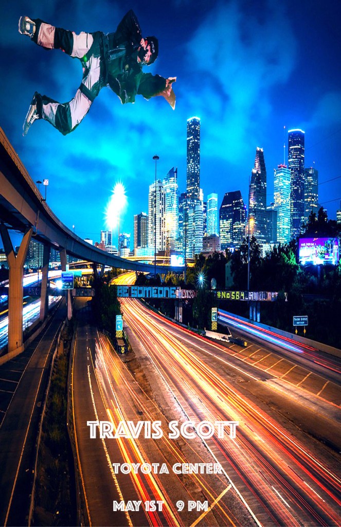
The design format I went with for my concert poster was the perspective format. The perspective format gives the person viewing my poster a certain point of interest to have their eyes gravitate too. I chose this format for my concert poster because I felt that the perspective format showed off the background of the concert poster and the main content of the concert poster. That is why I chose to use the perspective format for my concert poster.
The font I used for my concert poster was Phosphate. I chose Phosphate because with the city skyline in the background, Phosphate looks to me like a font that would be used on a large billboard while driving into the city and it just has a large city feel to me. Where it says the words “Travis Scott” are the biggest fonts and where it says “May 1st, 9 Pm” is smaller but still uses the same font and white color so both texts stand out in the sky on the concert poster. I put the words in the top right corner of the concert poster because it was really the only “white space” left in the concert poster.
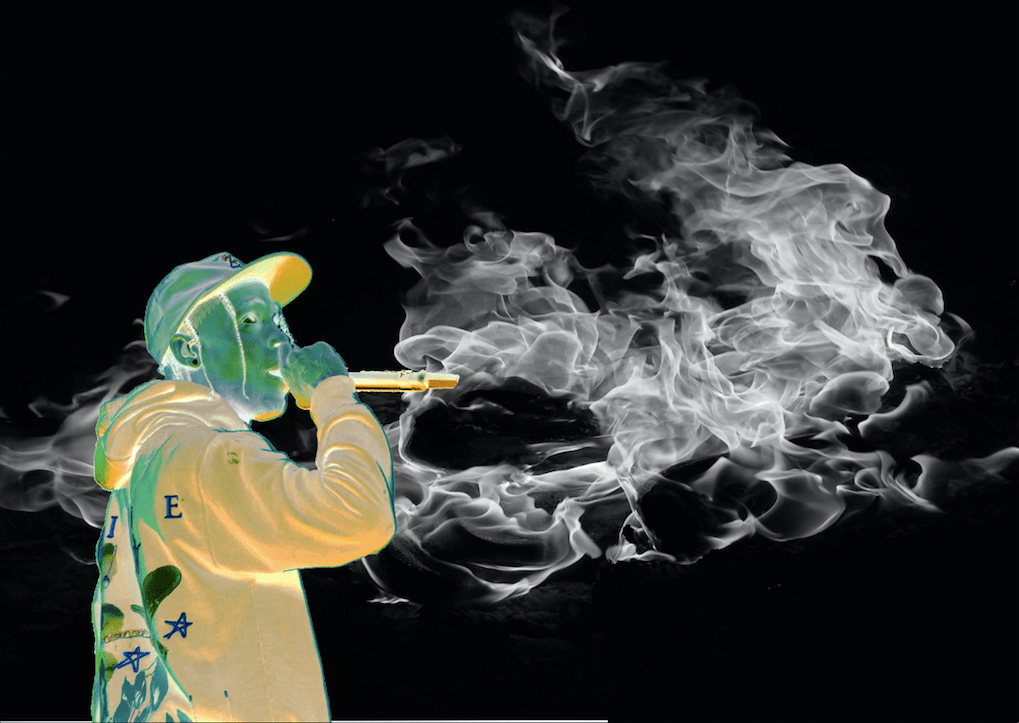
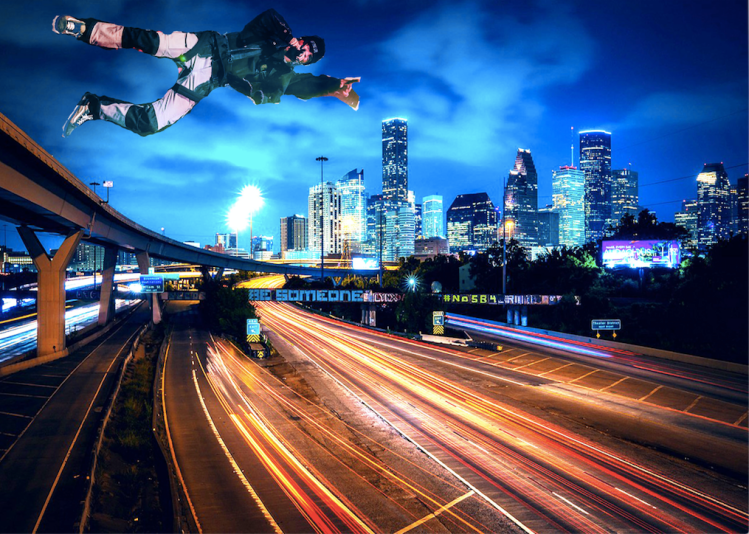
Both images I used are images I found on google that correlated with the terms of being allowed for reuse if there were modifications of the images. I used the Houston, Texas skyline for the background of the concert poster because Houston is the hometown for the artist I chose, Travis Scott. The second image I used an image of Travis Scott jumping and the outfit he was wearing in the photo almost looked like he was wearing a parachute of some sort. That is why I positioned him in the upper left corner above the skyline to give off the impression that he was parachuting into the city or flying. The images were changed to meet the 50% mark by blending the photos with different effects and changing the dimensions of the photos. The blend I used for both images was Hard Light. I used the “white space” of the background by putting the image of Travis Scott and the text in the “white space” at the top of the concert poster.
One issue I ran into while creating this poster was trying to remember how to blend photos and out certain effects on images of my concert poster. I solved this problem by reviewing old notes I took in class and by looking up videos on Youtube. I used photoshop to create my concert poster which I believe was the easiest and most efficient program to use because everything you needed to use to create a concert poster was available and easily accessible.
